It’s a misconception to think that designing a mobile app is simple. In most cases, designers get it wrong by designing mobile app designs that are not engaging to the user. An effective mobile app should not just look good, but also provide a good user experience. In this article, we are going to share with you 5 effective mobile app UX tips to help you create better apps on your mobile development. Mobile apps are a modern technological advancement that has taken the world by storm. Every industry nowadays has an app or several apps to help them simplify and carryout industry tasks fast, effectively, and efficiently. Research done by google revived that an average app user has 36 apps installed on his or her smartphone. Out of 4 of these apps, only 1 is used daily while 1 is never used.
An app’s design determines a lot of its usage. How the app looks like doesn’t matter, the bottom line lies with usability. Mobile app users don’t just download and install a mobile app for the sake of it, they want to know whether it’s worth their time. An engaging app reduces the chance of it being uninstalled due to its usability. If you are a mobile app developer, your goal should be making your apps easy to use since that is what most users are after when installing apps. That said, how then do you make create apps with engaging designs?
1) Personalize your app UX for your users
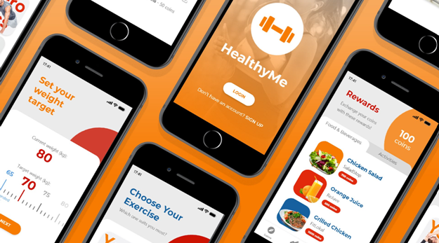
We can although each app user is unique, however, it is important to have a target audience in mind when designing your mobile app user experience. Get rid of the notion that every one-size-fits-all, since it doesn’t cut it anymore when designing app UX. You can maximize data to provide a custom experience to your users. When you are looking for the right app development team, ensure that it has what it takes to lure in the target audience, capitalizing on consumer behavior, location, and settings options.
Let’s say you want to develop an app for your cab company. Most cab users expect convenience when ordering for cab services. Therefore, your app should allow the user to book a cab, in minimum time and few informative steps as possible. To help you with that, always ensure you know exactly a user wants when he or she is opening the app.
2) Cater to all screen sizes
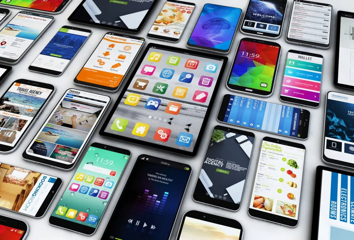
To design better mobile apps, don’t focus so much on a particular mobile screen size that you think your users will like. Mobile development has been here with us for a while now, however, it’s hard to understand why some app developers fail to understand that the user experience of mobile is different from desktops. Most of the time, desktop designs won’t work well on mobile devices.
For this reason, you should always make your mobile app design responsive to kinds of mobile screens is you want to attract the right audience. Each element in your design should be placed strategically to make a mobile app user comfortable when using his or her app. Since mobile apps are often halted by services issues, ensure that when these issues occur while the user was using the app, they can pick up from where they left before the interruption occurred.
3) Capitalize on seamless micro-interactions

Many social networks are already capitalizing on micro-interactions. For example Facebook, Instagram, Snapchat, and Twitter. This doesn’t mean that you shouldn’t do the same. It is working for them, which means that it should also work for you. Always focus on simplifying your apps micro-interactions, to leave a good impression and improve the mobile app UX design.
The engagement level of your app is going to shoot up due to interaction experience, feedback, notifications, and sharing. As you do this, don’t forget the interface aspects of a mobile app that need to be optimized to cater to smaller screens for a seamless experience.
4) Simplify and minimize
Playing safe means simplifying your app design if you are not so sure if it will work or not. Most app designers make UX worse by adding a lot of baggage in their designs, thinking that it will appeal to the user. Having a minimalistic design helps the user to concentrate on the core message without feeling overwhelmed. If you can deliver navigation, content, appealing design with a simple design, then do it with confidence.
A good place, to begin with, is by making your menu bar more intuitive and easy to use. Avoid using long texts of instructions on how to use your app. A creative way will be to use visual iconography which is more efficient and also saves space. The reason why many apps are not effective enough is that many app developers struggle to create perfect apps like human beings are hard to achieve. As long as you are trying to make your app better and efficient, there are plenty of opportunities out there.
5) Design for fat thumbs
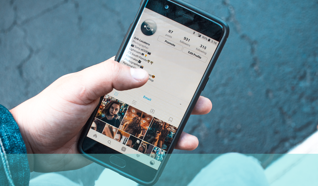
This goes without saying, but the majority of the apps and websites should be designed to cater for the thumb. I don’t know of anyone who doesn’t use his or her thumb to do stuff on a smartphone. To make your app’s UX better, make variants and buttons adjustable to cater to fat thumbs. It’s frustrating when a user browsing an app tap a single variant on the phone and ends up tapping two variants. Avoid placing buttons horizontally, next to each and also at the bottom of the screen. Make action buttons big enough when you design a mobile app, but not so big that they cover the whole screen. This will make navigation easier for the app user.
Conclusion
The best way to improve your app UX is by researching and keeping an open mind. Always be ready to adjust and adapt to the current trends and technology to meet the users’ expectations. Failure to update your designs to the latest tech will make you lose focus on what matters most when it comes to designing effective mobile app UX.


